Moma, founded in 2006, made a significant move into the oat milk market and has since become the third-largest oat milk brand in the UK.
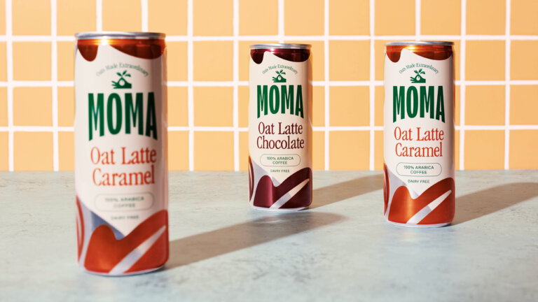
While browsing the canned coffee section at my local supermarket, I stumbled upon Moma’s newly rebranded cans. Initially confused by the updated packaging, I took a closer look online and discovered that the fresh design came from Together, the creative agency behind the overhaul.
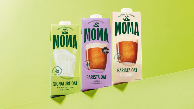
I’m really impressed with how they’ve elevated the brand. The new look feels both aspirational and mature, with a more trendy, vibrant energy compared to the previous packaging. It’s clear that many brands, particularly those from the early days of veganism, are shifting away from the playful, approachable styles seen in brands like Innocent and Pip & Nut. Instead, they’re embracing a more sophisticated aesthetic that speaks to a wider, more health-conscious audience — one that is not strictly vegan but values plant-based, sustainable choices. This shift moves away from the often-stereotyped “vegan” image and positions these products as simply part of a balanced, inclusive lifestyle.
The new Moma branding really highlights the brand’s commitment to the oat itself, emphasizing its versatility, taste, and health benefits. The illustration of a hand gently holding oat grasses is a beautiful touch, symbolizing the craftsmanship and dedication that goes into transforming the humble oat into something truly special — a sentiment highlighted on the Together website.
This refined approach feels like a smart strategy. In coffee shops everywhere, Oatly has claimed its spot behind the espresso machine with its bold, instantly recognizable packaging. I can see this updated version of Moma following suit, challenging the Oatly norm, and becoming a go-to choice for baristas and consumers alike.
Images from Together Design