If you’ve spent more than 10 minutes with me, you’ve probably already endured a solid 9-minute audible barrage about baseball. I didn’t fall in love with sports until a lot later than most, and I’m also into the ones that most people in the UK couldn’t care less about. Apologies in advance, football is not the game for me. During baseball’s offseason, I’ll usually just sit around feeling sorry for myself, reminiscing about those beautiful summer months when I could watch a sport that’s effectively a marathon, and buy out Sainsbury’s supply of vegan hot dogs.
This year, to keep the winter depression at bay, I decided to give hockey a whirl. It’s faster, way more intense, and a whole lot more aggressive than baseball—but I’m falling in love with it. Even though my Toronto Maple Leafs break my heart almost every day, I’ve found a huge boost in something baseball doesn’t have: a professional women’s league.
Enter the Professional Women’s Hockey League (PWHL), which kicked off its second season this year with a whole new look. It’s criminal that it’s taken until 2023 for these incredible athletes to play at this level, but the bright side is that we get to experience one of my favourite things about pro sports: fresh team branding.
Last season, all the teams went by the name of their city, but this year, we’ve got team names, killer logos, and effortlessly cool jerseys.
So, please, welcome to the ice:
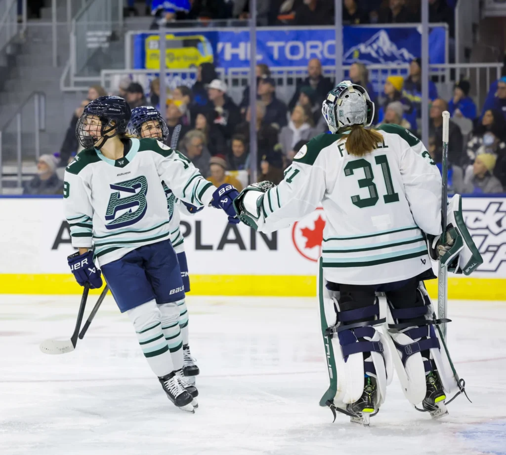
- Boston Fleet
- Minnesota Frost
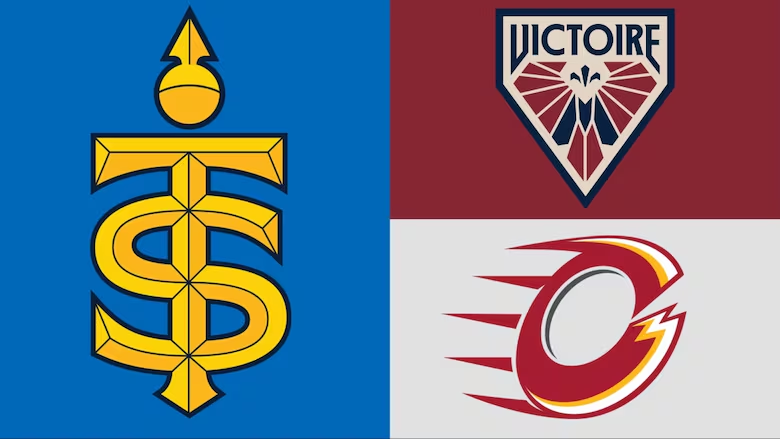
- Toronto Scepters
- Ottawa Charge
- New York Sirens
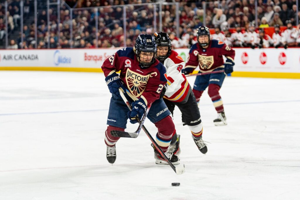
- Montréal Victoire
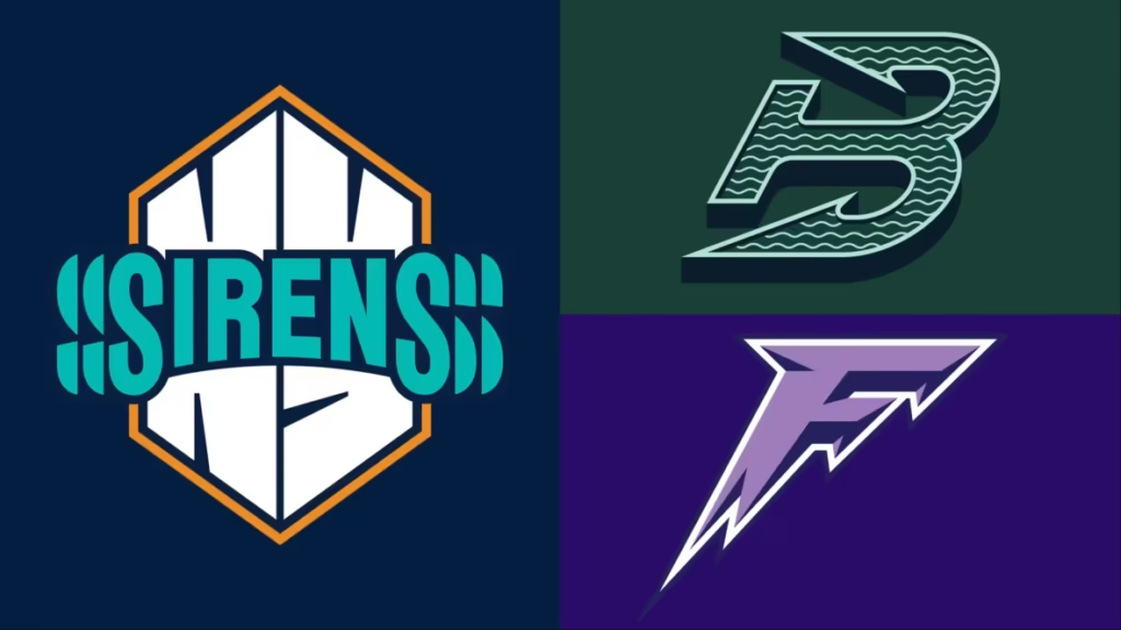
I’m in love with the names—they all have such cool connections to their respective cities, and the promo videos rip. Each team’s logo is even animated! It’s a branding dream come true.
Now, despite my undying loyalty to all things Toronto sports: my absolute favourite logos are from the Minnesota Frost and Boston Fleet. Boston’s logo is slick & nautical. With a stylized “B” that doubles as an anchor, wave lines flowing through it, and a color palette that ties it all together. It’s giving Hartford Whalers, and we can all agree that logo was awesome (RIP).
The Minnesota Frost logo is an icy, sharp “F” that captures the brutal winter of the state. It’s fierce and intimidating—fitting for a team contending for the title again.
I think the way all the logos were released at once is fascinating. Designed by New York’s Flower Shop agency, they all work together as part of a cohesive brand family, but each one still feels distinct. To me, it’s a branding triumph.
Images from the PWHL